Macquarie University Student Experience Projects
Improving onboarding and enrolment through UX & service design
Services
UX/UI Design, Service Design
Platform
Web, Internal Systems
Role
Lead Experience Designer
Duration
Sep 2022 – Jan 2023
Project Overview
This case study combines two service and UX design projects completed for Macquarie University: the “Getting Started Toolkit” and the redesign of the university’s online enrolment experience. Both projects aimed to improve key student touchpoints, reduce confusion, and foster a smoother university onboarding journey.
Challenge
Students found both the onboarding and enrolment experiences confusing and inconsistent. The existing information was fragmented across webpages and emails, and the enrolment system was visually outdated and cognitively demanding, especially for international or first-year students.
Discovery & Research
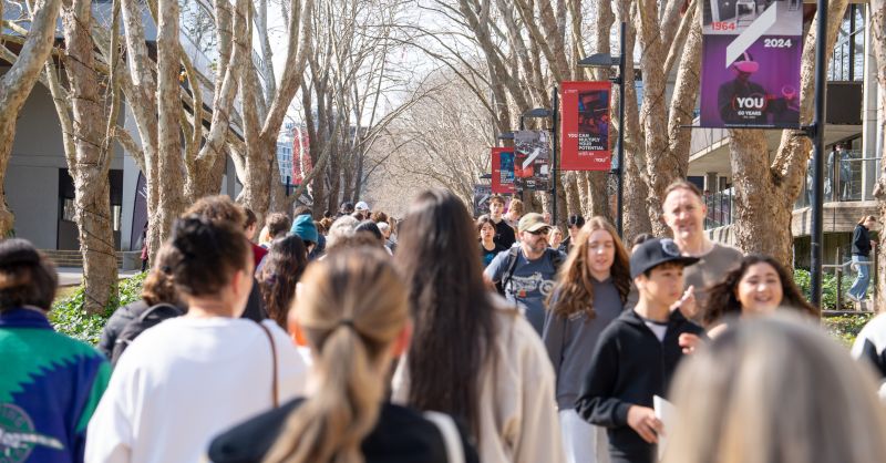
Through interviews, usability testing, and staff co-design workshops, we uncovered pain points such as unclear terminology, lack of step-by-step guidance, and misalignment between EDM content and web interfaces.
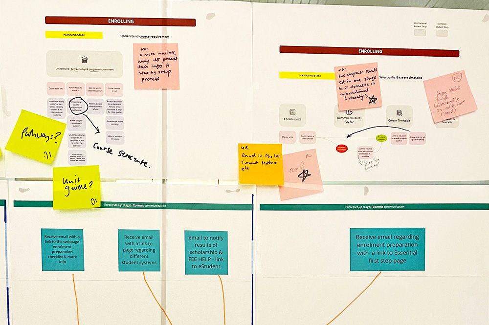
↑ Co-design workshop with university staff
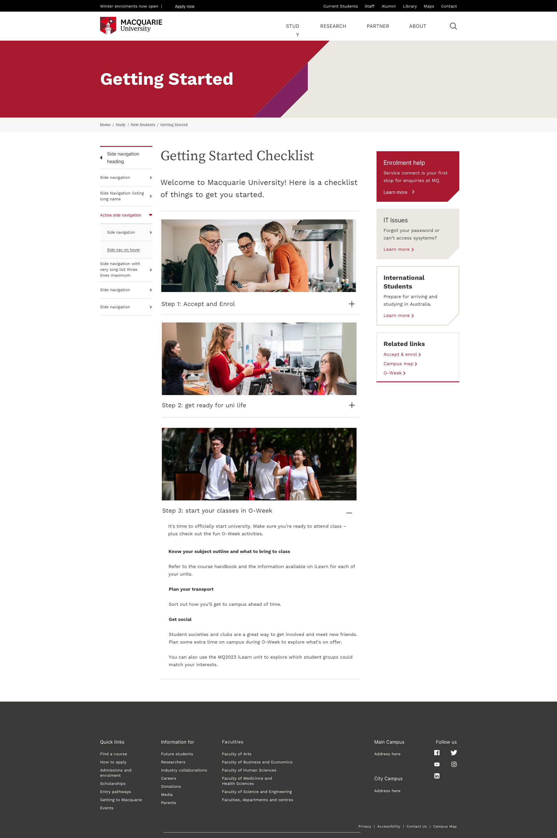
1. Toolkit Design: Getting Started
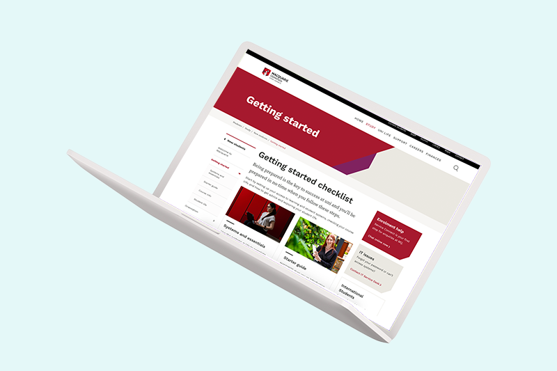
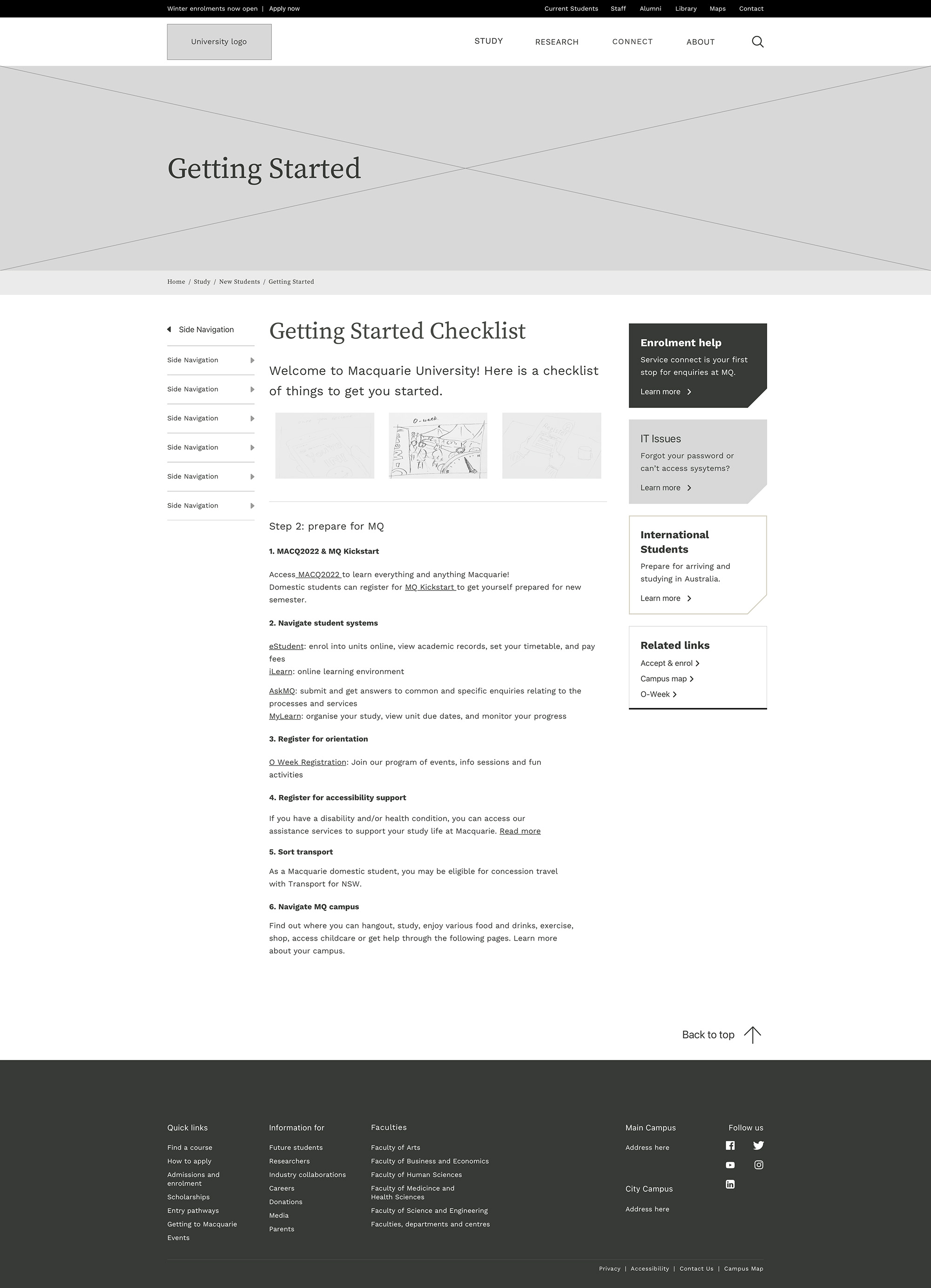
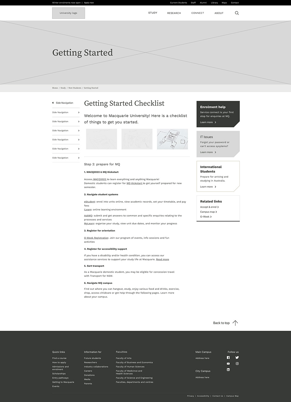
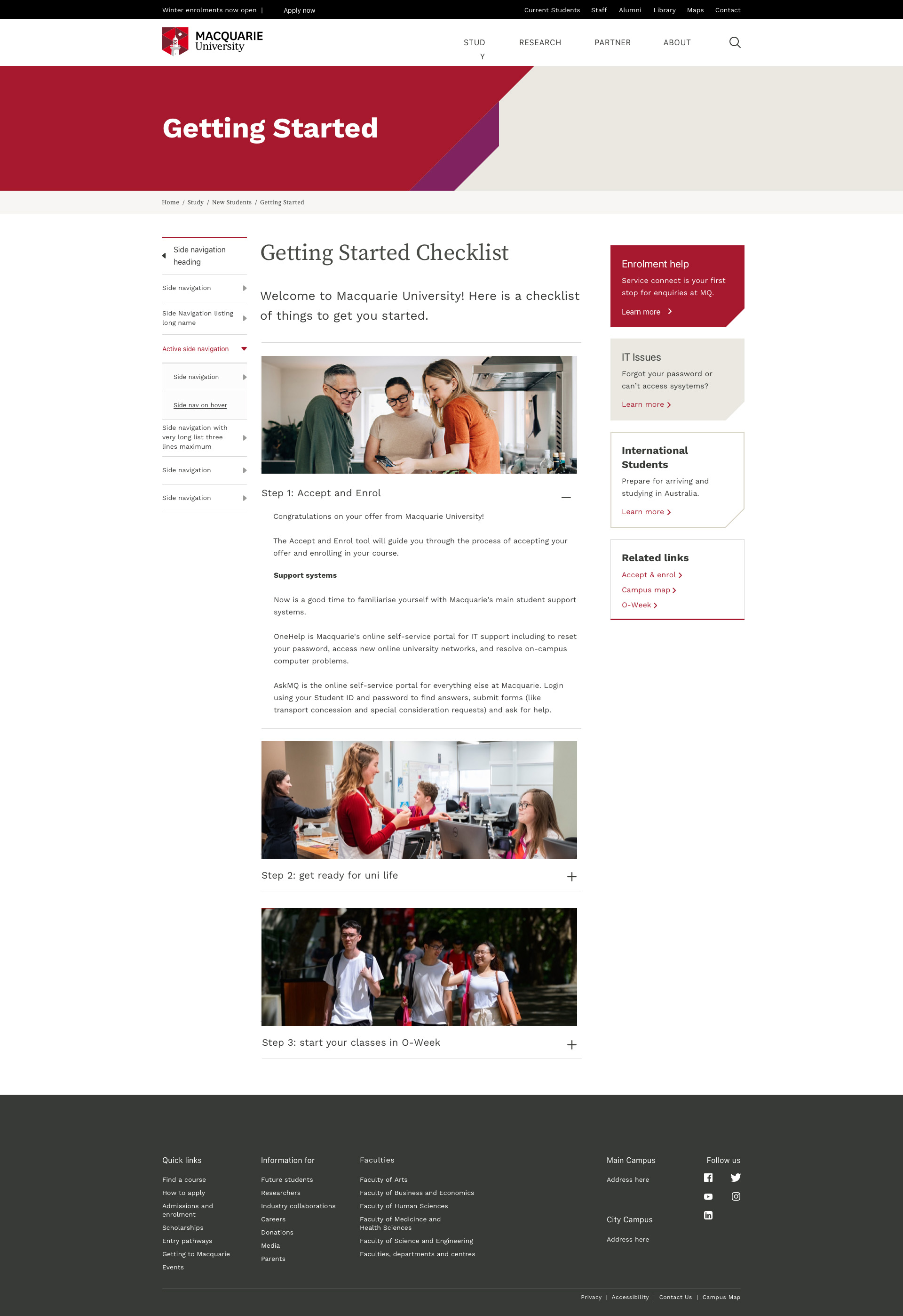
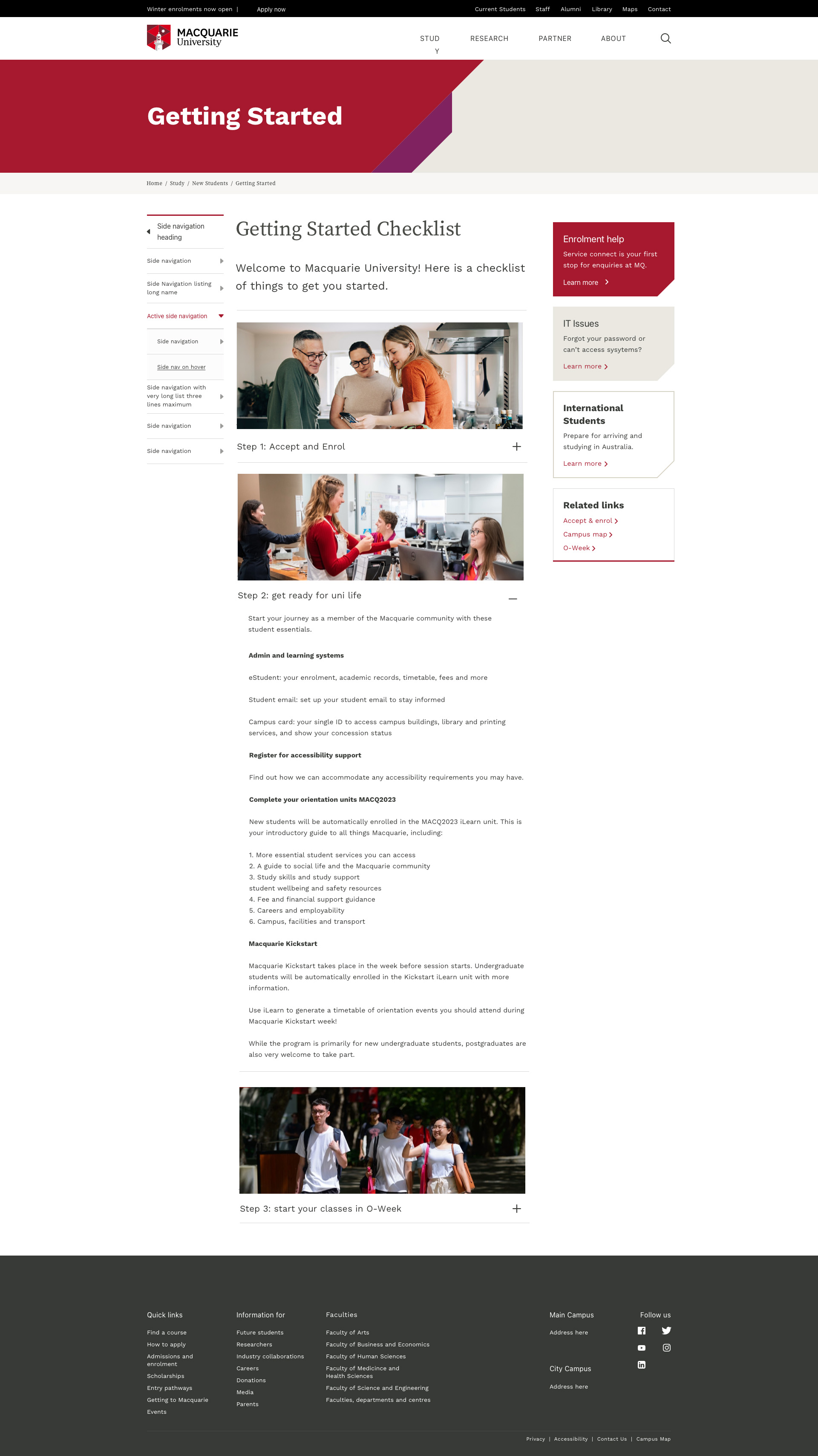
We created a digital checklist aligned with the university's email campaigns to ensure consistency and reduce mental load. The toolkit offered a clean, visual guide for new students to complete tasks in a logical order, integrated with links and explanations.
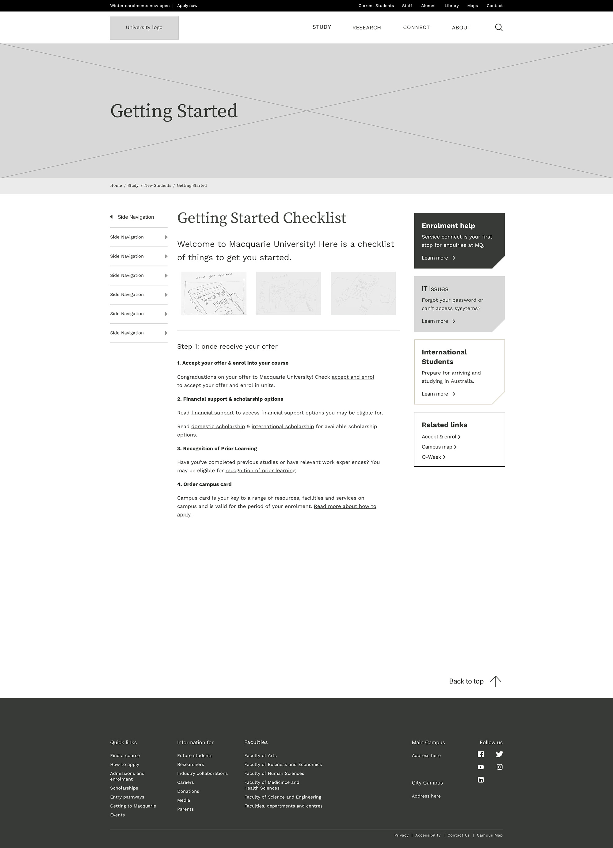
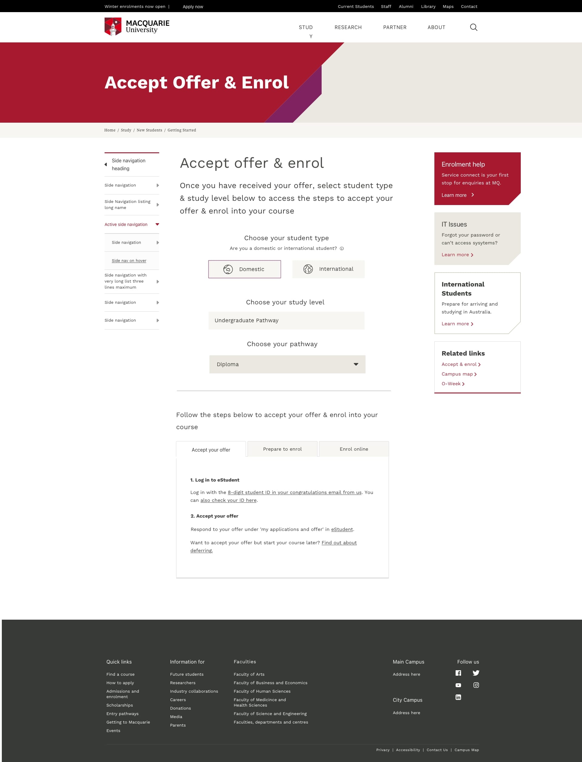
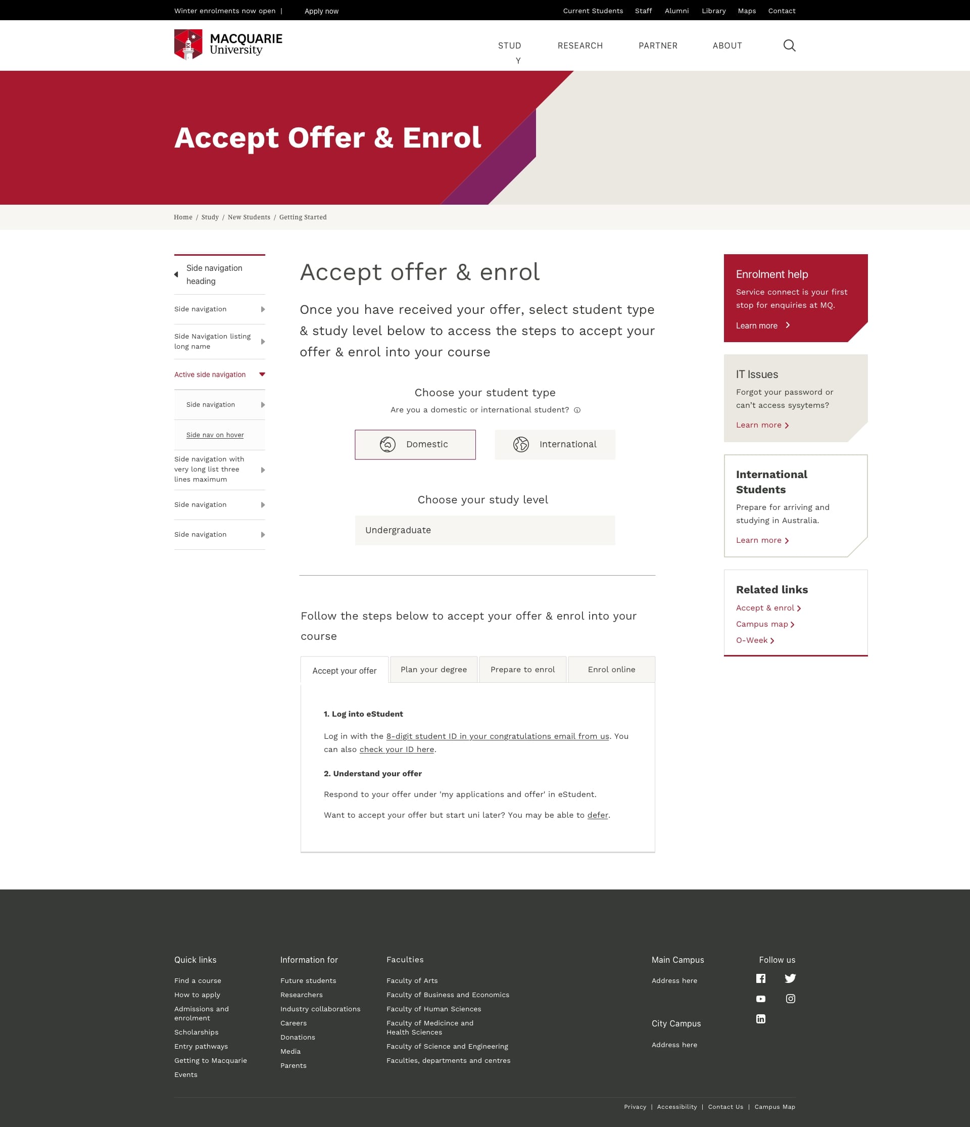
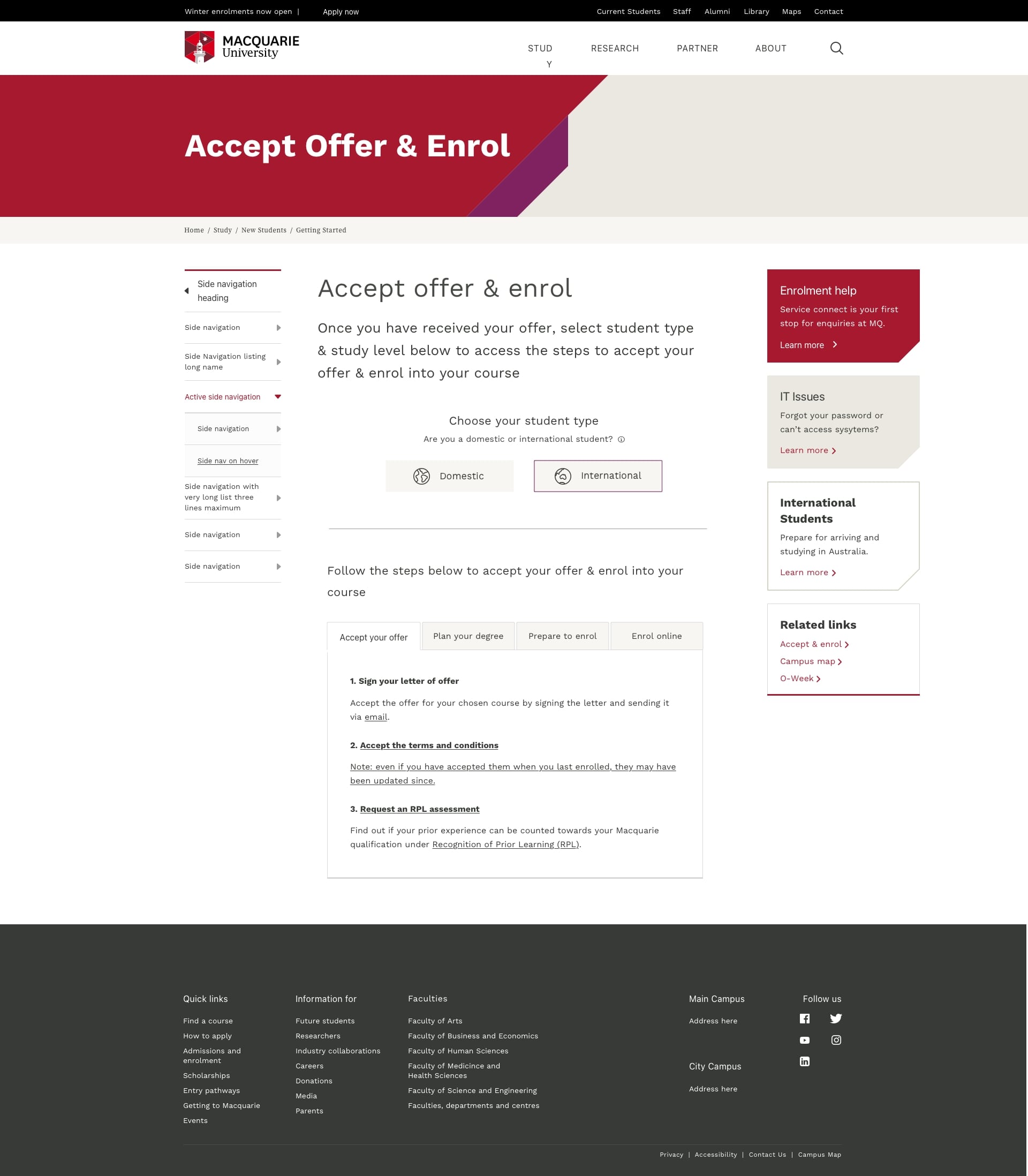
2. UX Redesign: Enrolment Webpage
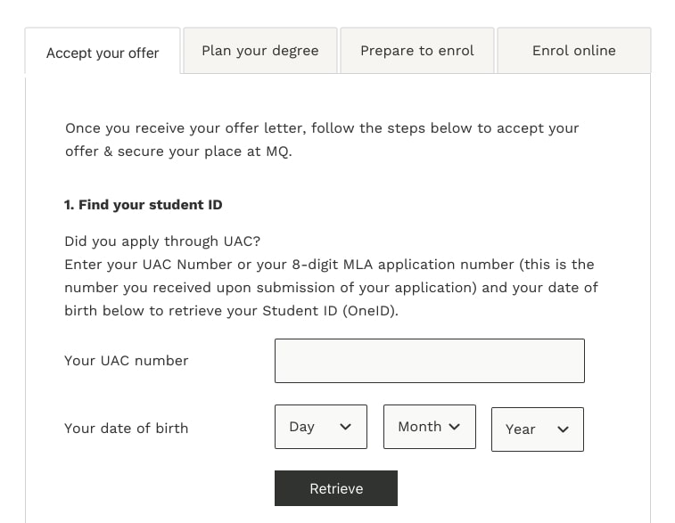
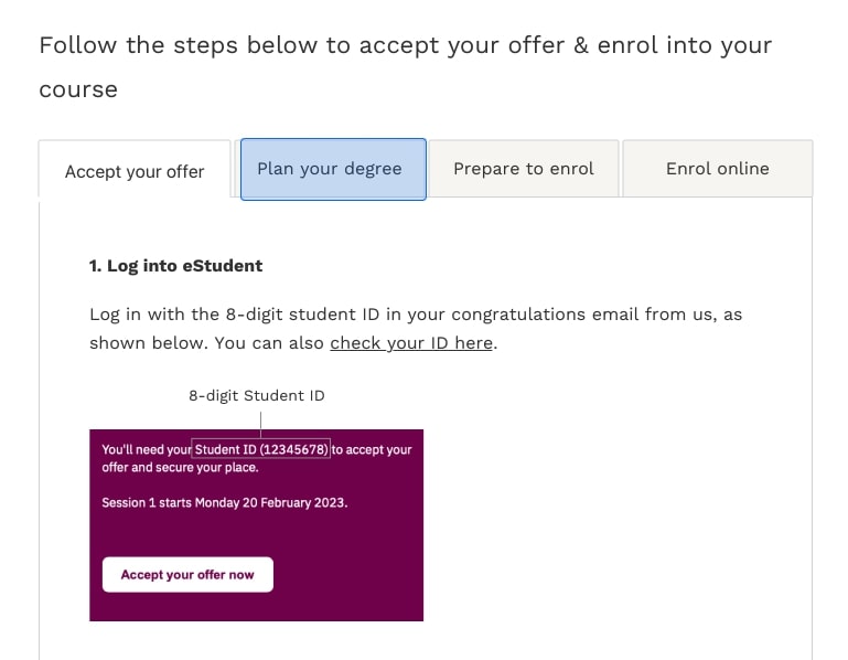
We redesigned the enrolment page to simplify language, introduce a step-by-step visual journey, and reduce the intimidation factor. Icons and diagrams were used to support user understanding of terminology like “unit selection” and “credit points.”
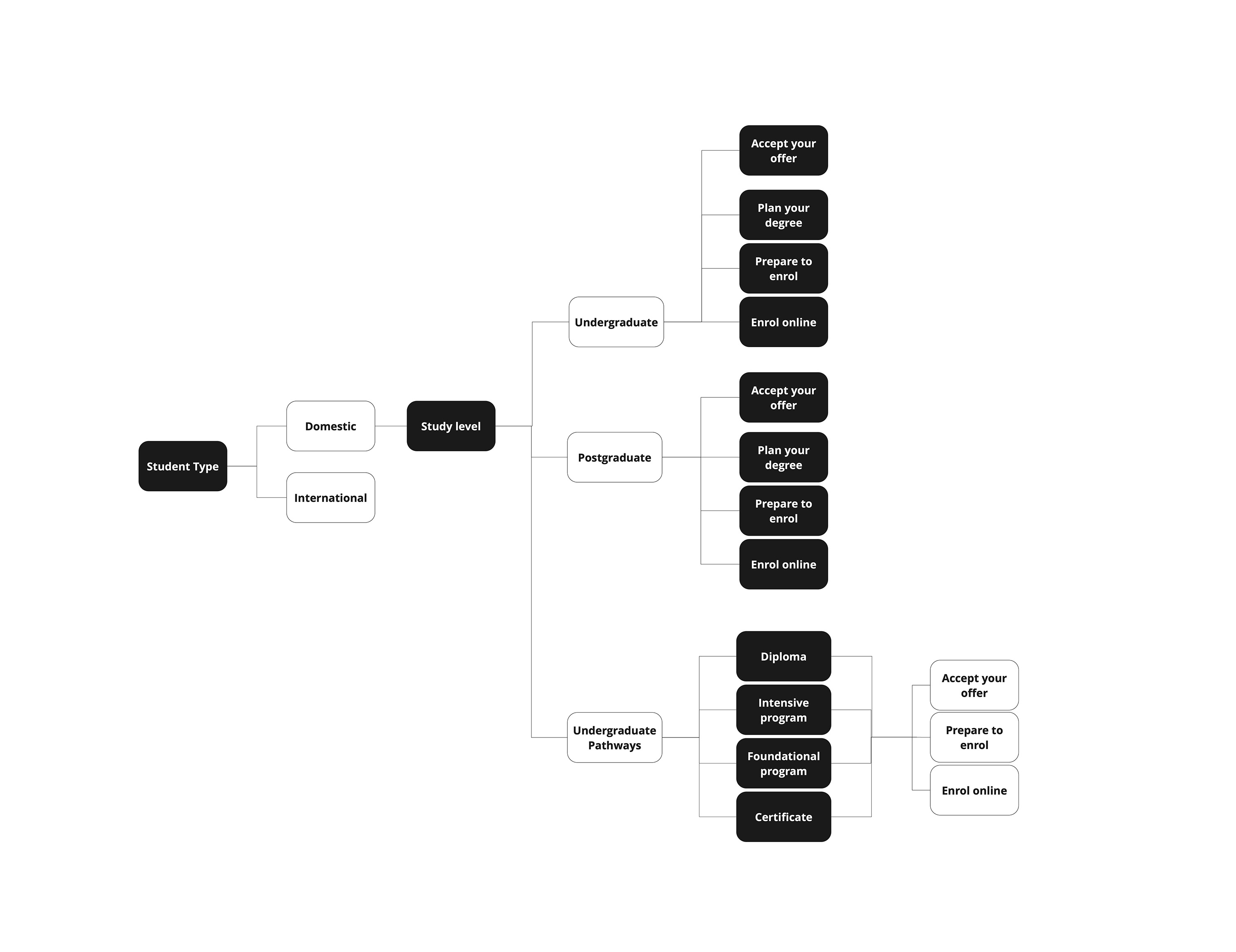
↑ Enrolment Page User Flow
2.1 Usability Testing
We conducted six usability testing sessions with current Macquarie students to evaluate our prototypes and gather feedback. These sessions helped us identify confusing elements in the webpage’s information architecture and layout, uncover cognitive barriers in how users processed the content hierarchy, and collect direct recommendations for improvement.
Outcomes
- Checklist toolkit adopted across multiple departments
- Reduction in student support queries during enrolment
- Increased confidence among new international students
Reflection
This project reinforced my belief that great design isn’t just about aesthetics — it’s about clarity, confidence, and compassion. By aligning communication channels and simplifying journeys, we made a stressful transition smoother for thousands of students.